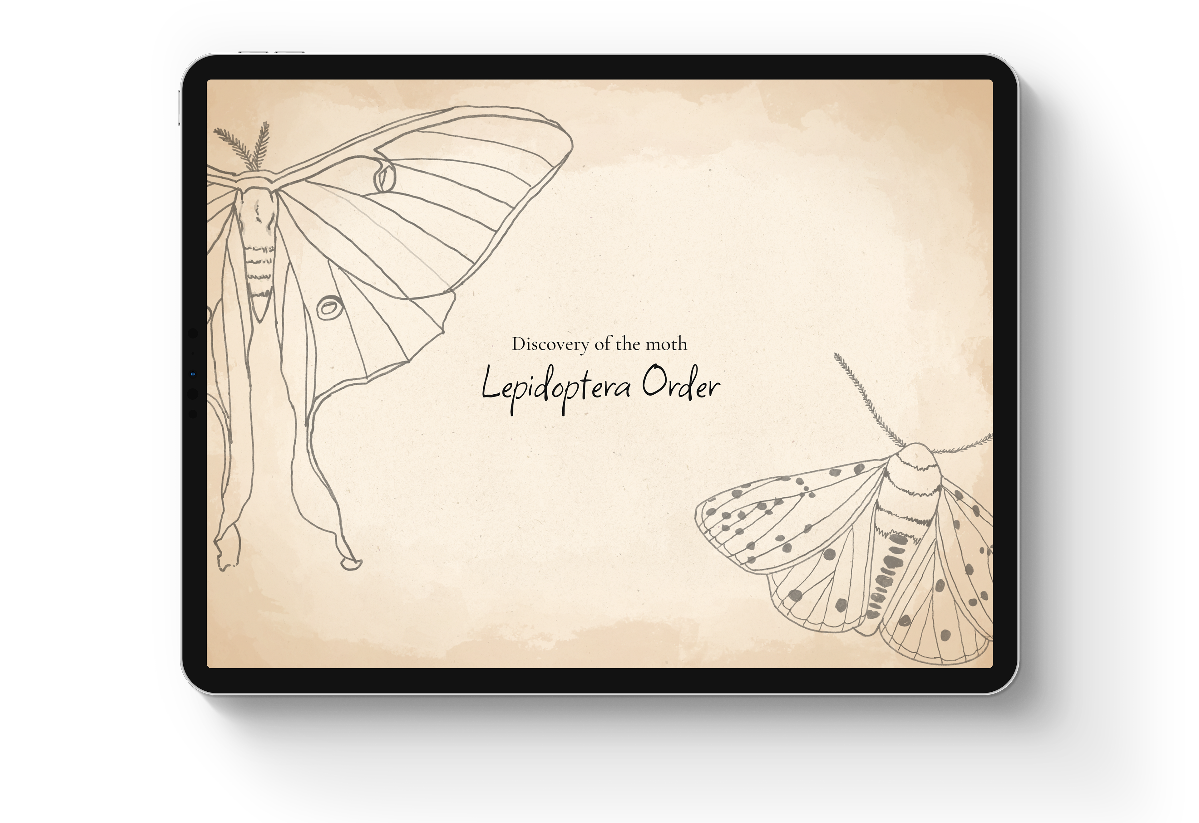
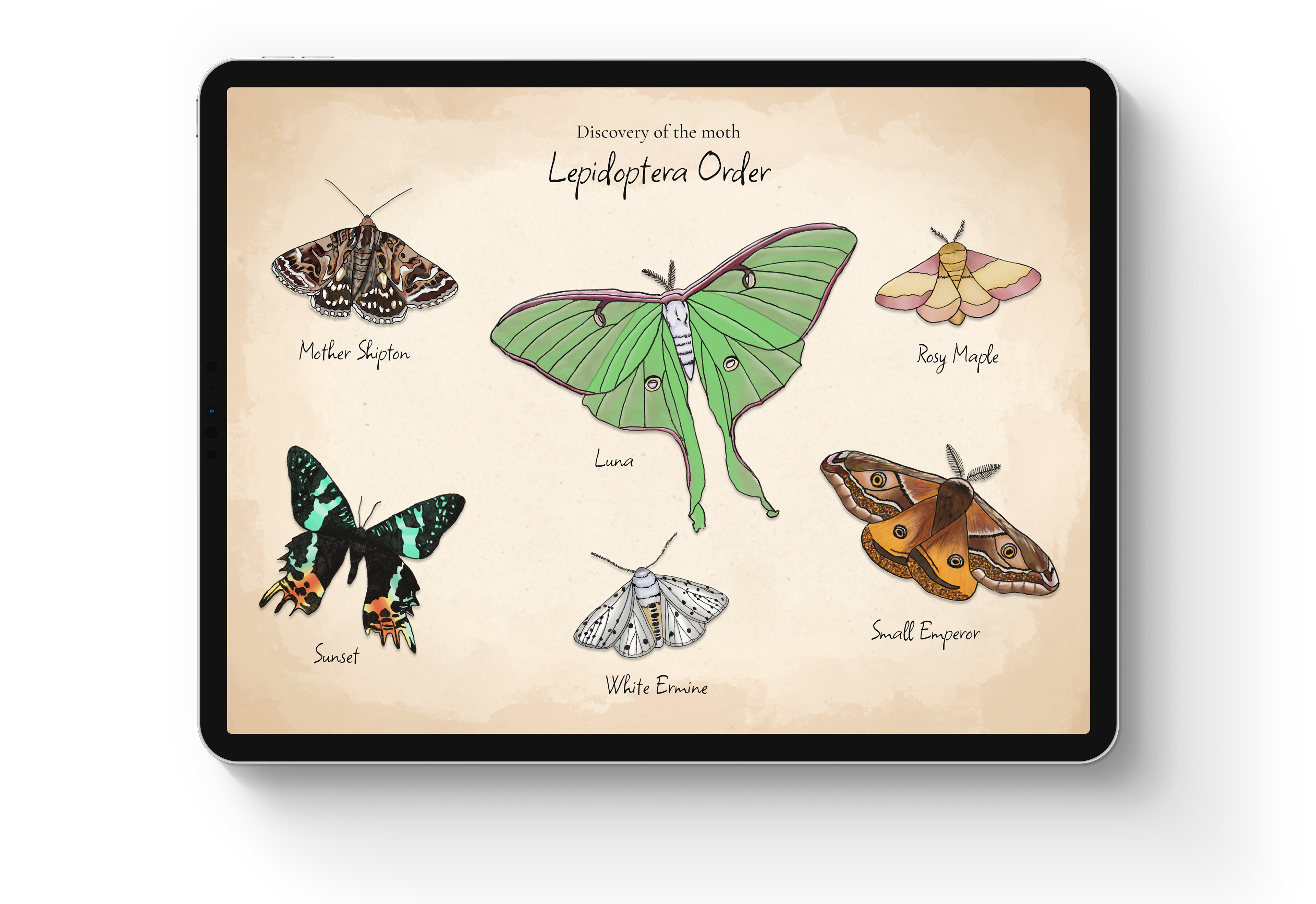
Discovery of the Moth is a tablet-based application designed to educate high school students about moths. Its primary goal is to enable students to acquire a deeper understanding of various moth species and their significance in the environment.
My role for this project was sole designer.
Prompt: Interactive Guide to Information
Duration: 10 weeks
Software: Figma and ProCreate
Skills: UI/UX and Illustration



Goals
This project has a dual purpose: to educate and engage. The goal is to inspire students to find joy in learning and develop an interest in the environment, highlighting the varied roles of different creatures. The specific focus is on educating students about moths and encouraging discussions about their importance in the environment.
Problems
Throughout my research, I utilized three guiding questions that proved instrumental in steering both the research and design processes. These questions played a crucial role in guiding and shaping the overall project...


Solution
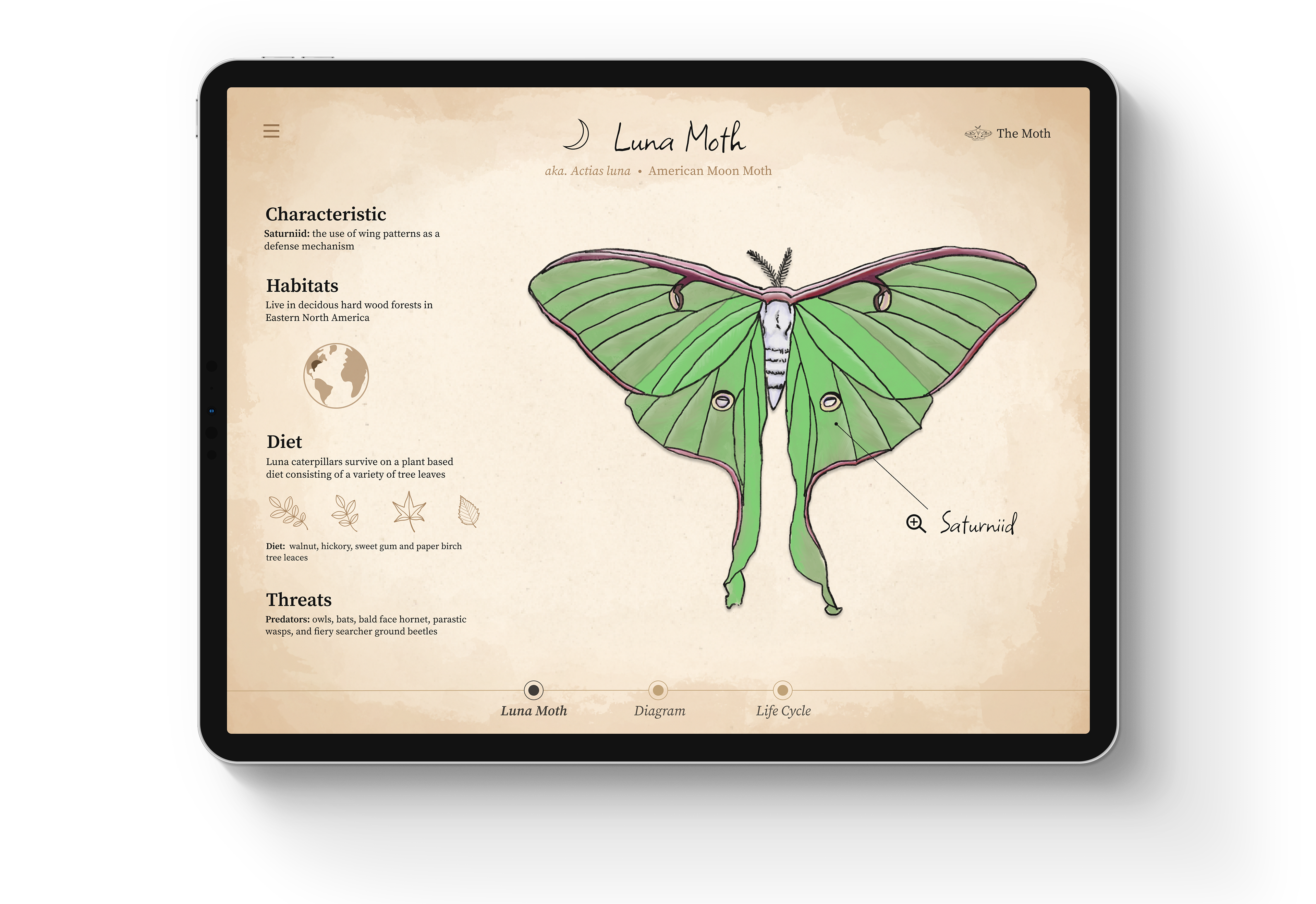
Discovery of the Moth application educates users on various aspects of moths, including their habitats, diet, threats, anatomy, and life cycle, presenting information in a clear and concise manner. This creative approach ensures that students learn quickly and effectively, offering a more engaging alternative to traditional textbooks. Visual elements such as illustrations and iconography are incorporated to capture users' attention and strike a balance between images and information
Lo-Fi Wireframes
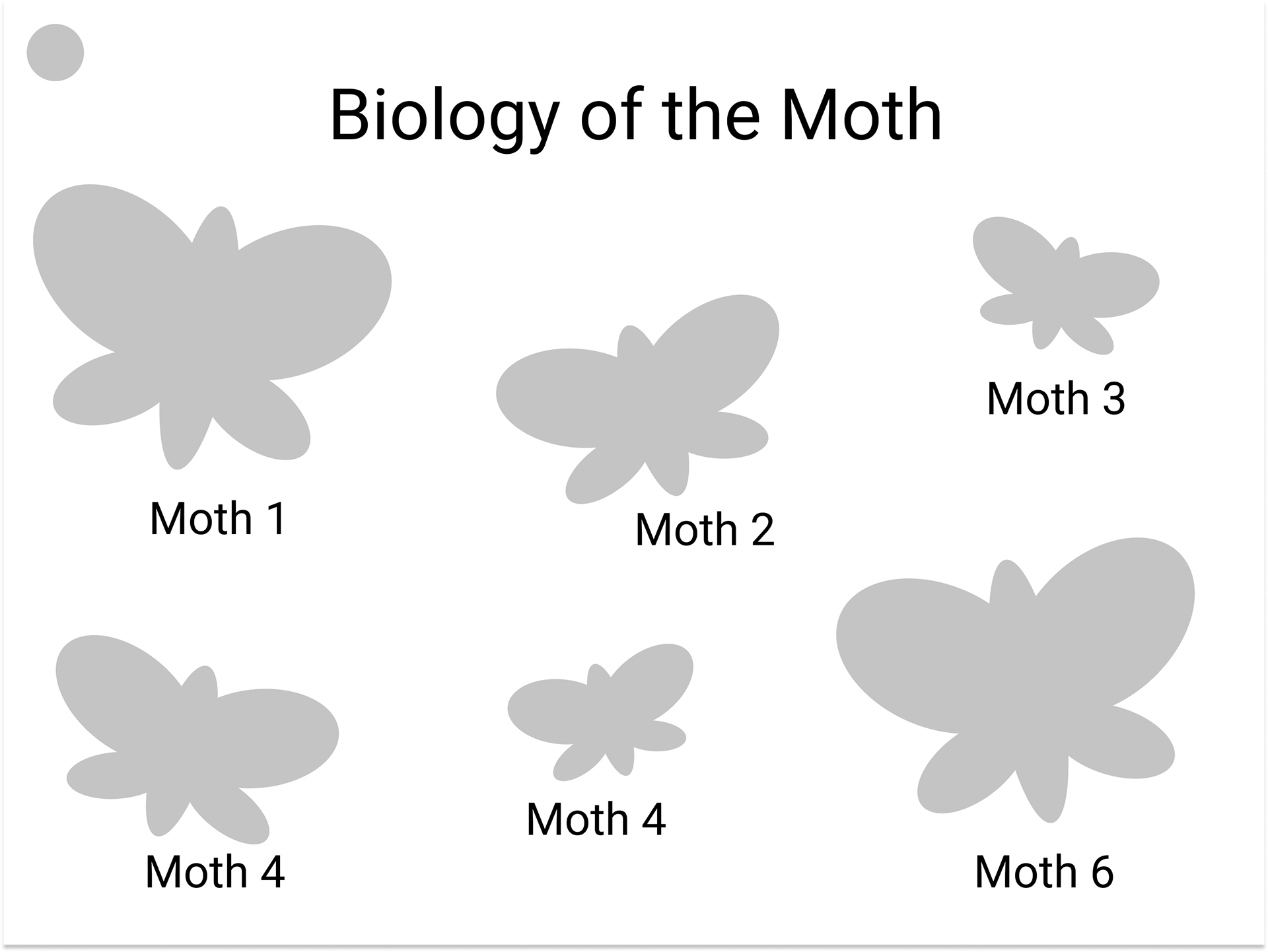
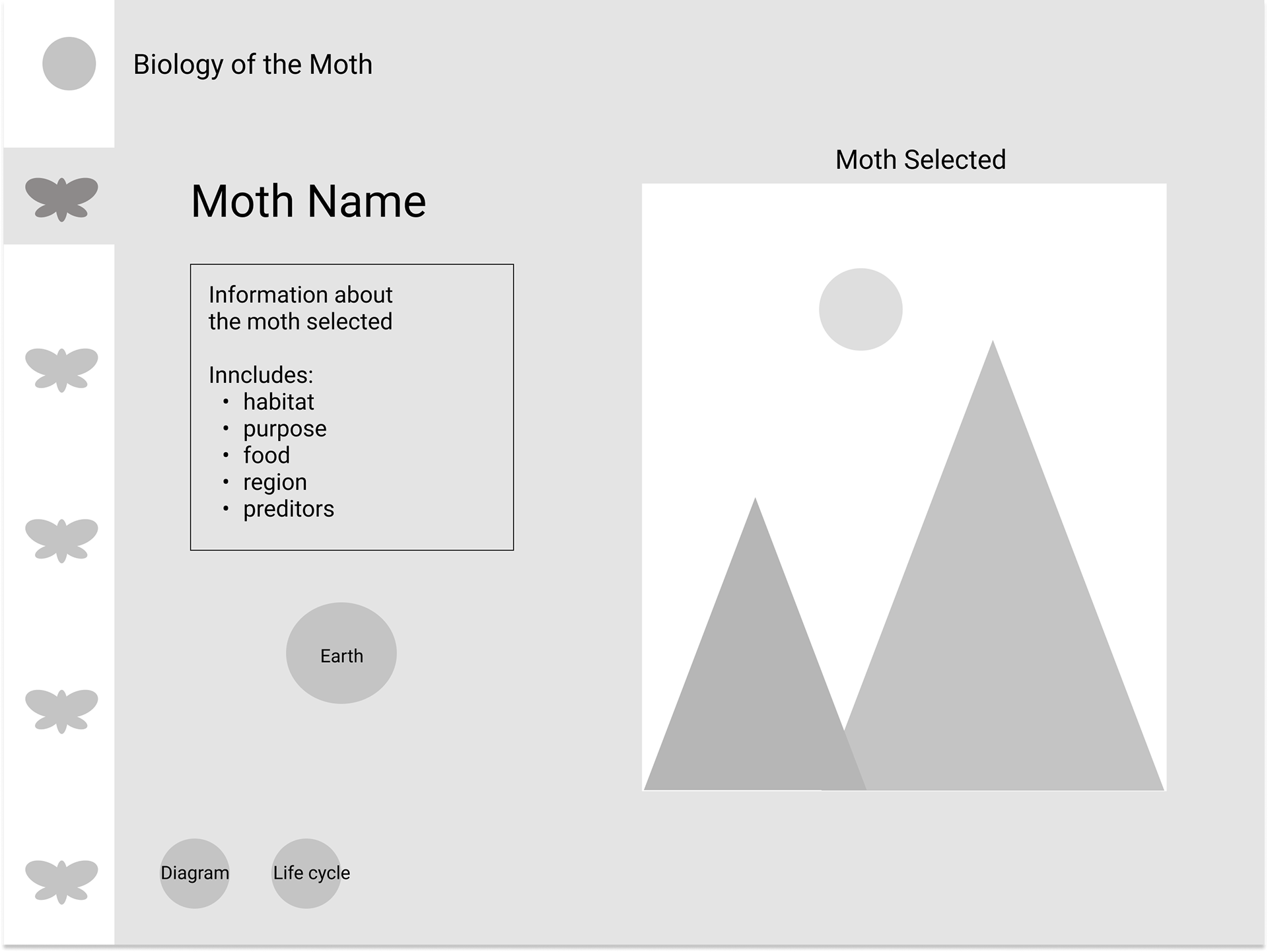
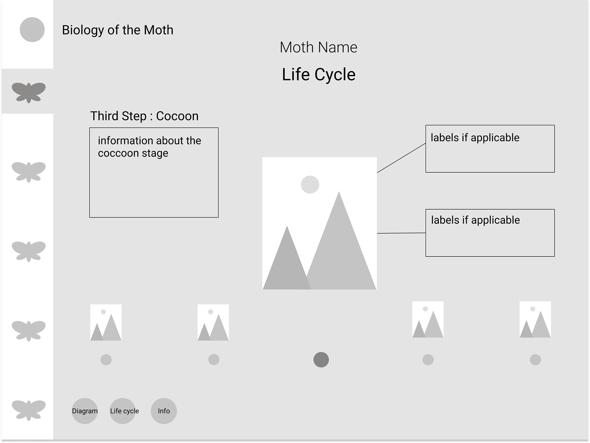
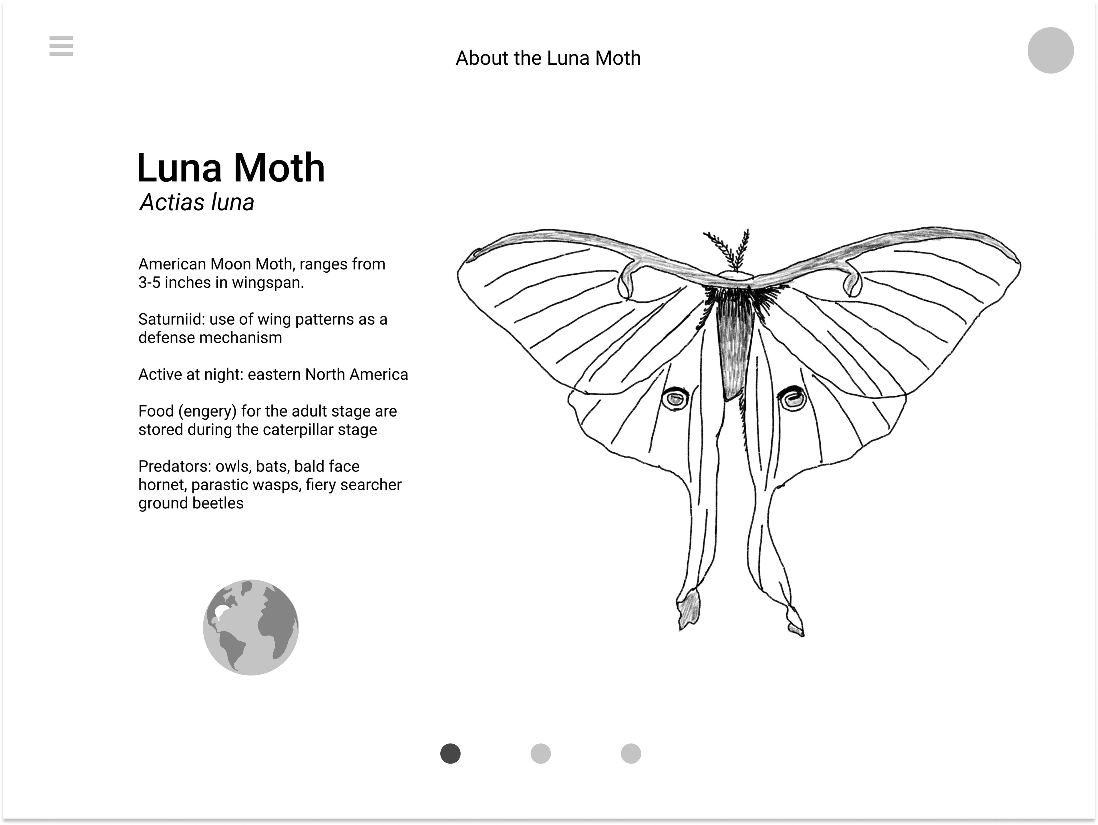
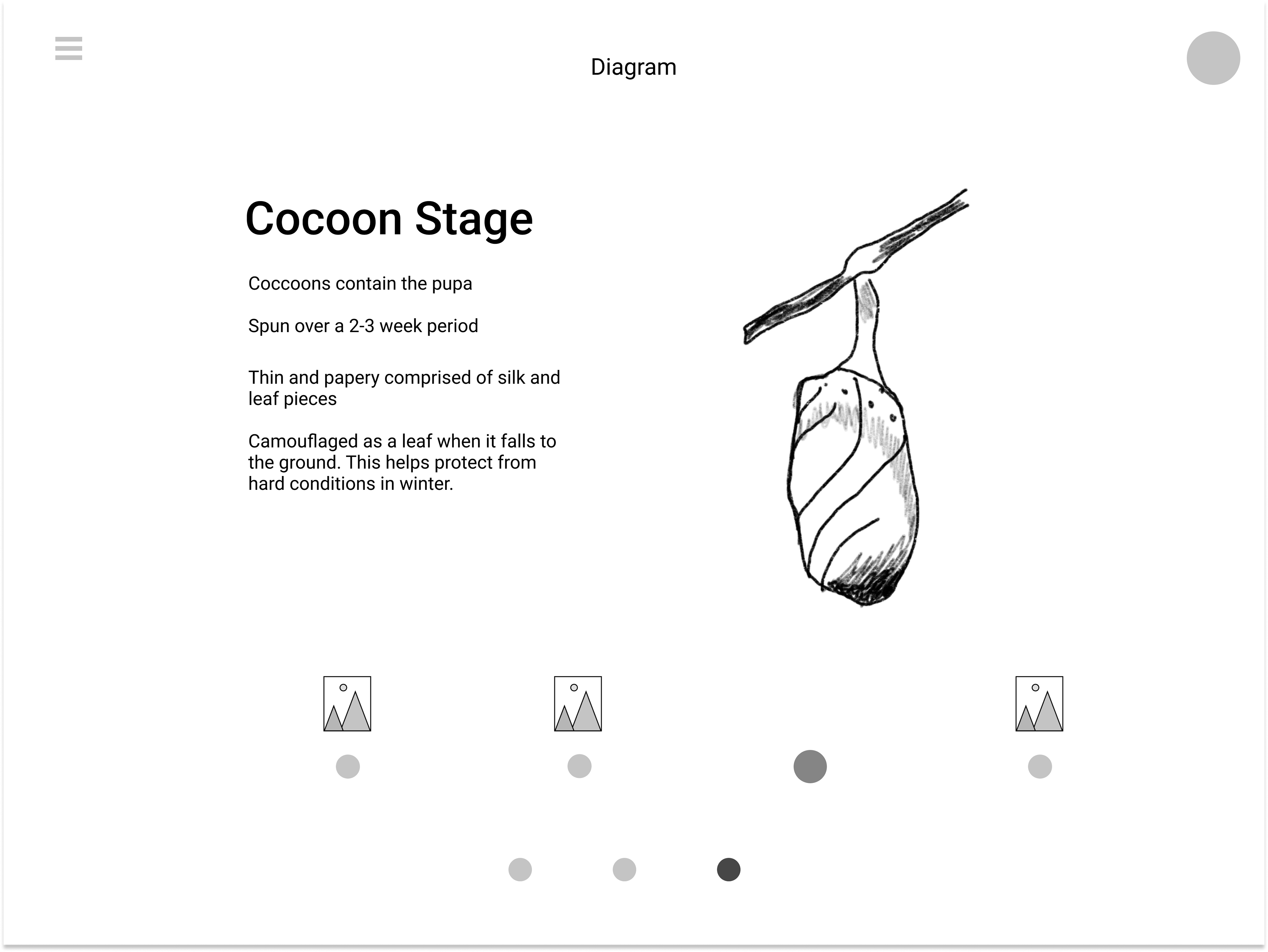
Presented here are the preliminary wireframes outlining the design of the application, arranged in the order of user interaction.
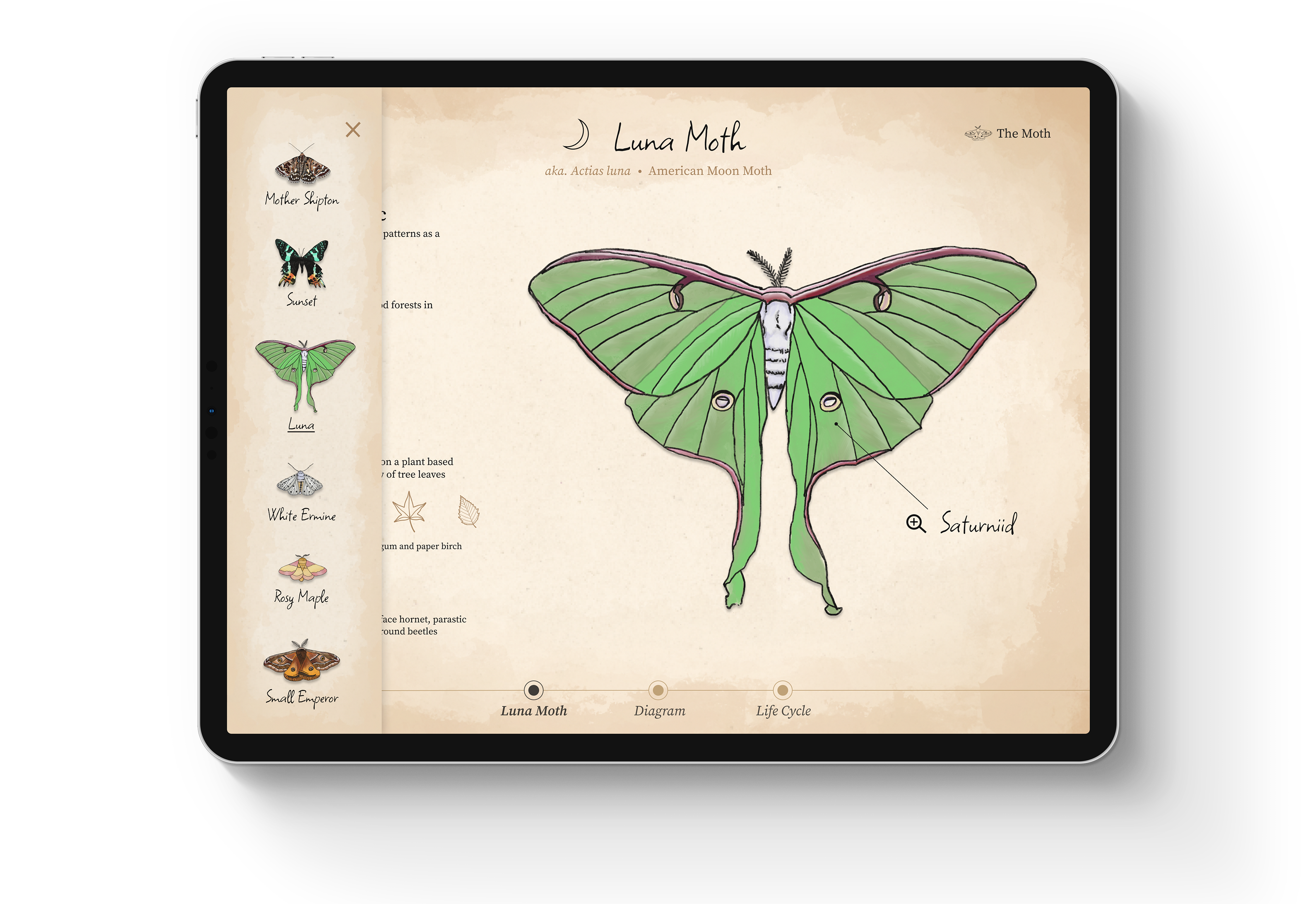
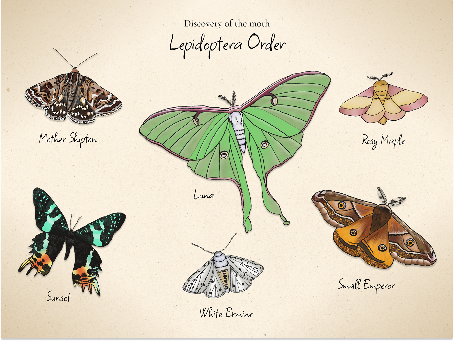
Gallery: Showcasing moths available for learning.
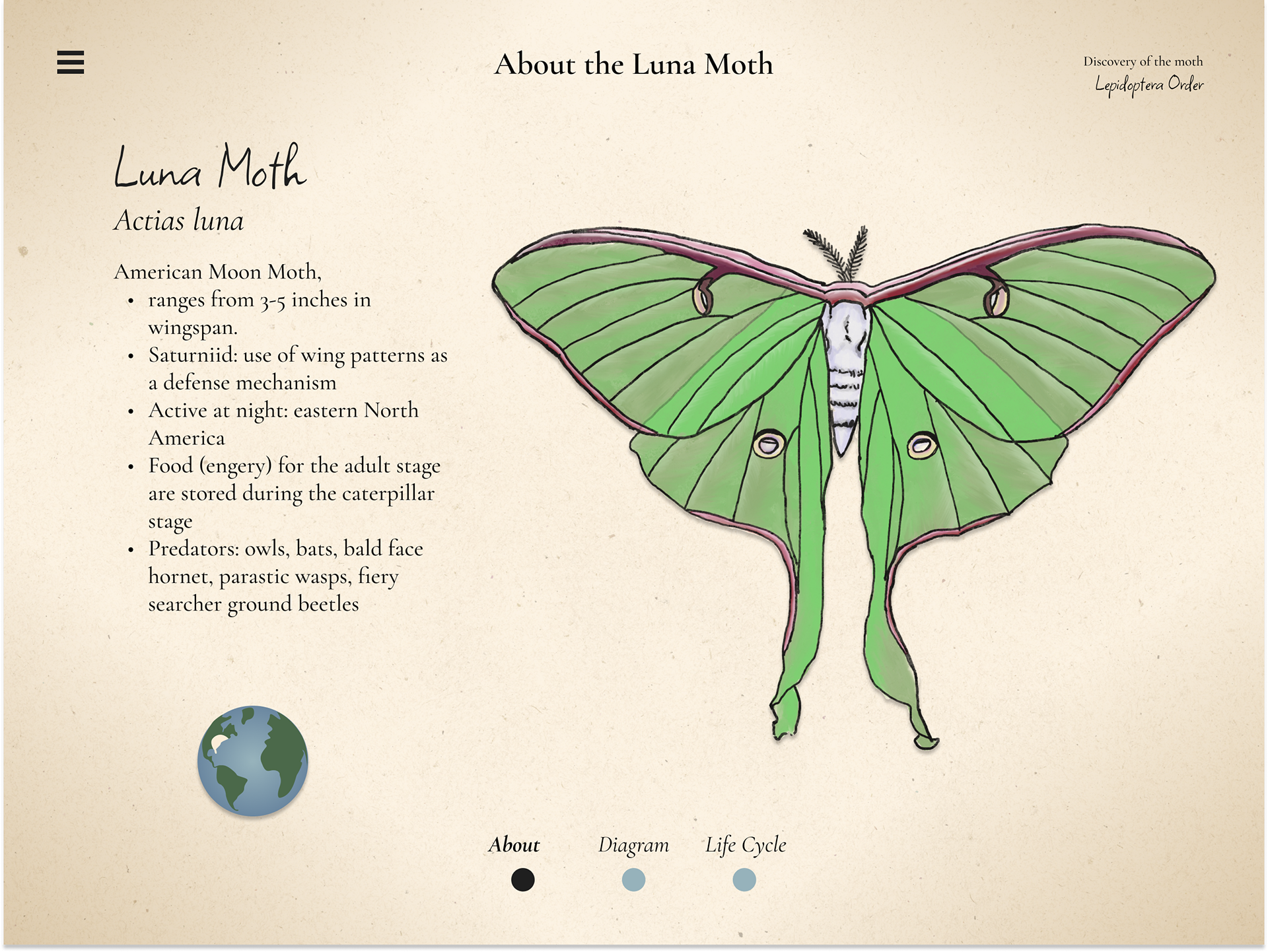
About: Providing basic information about the selected moth.
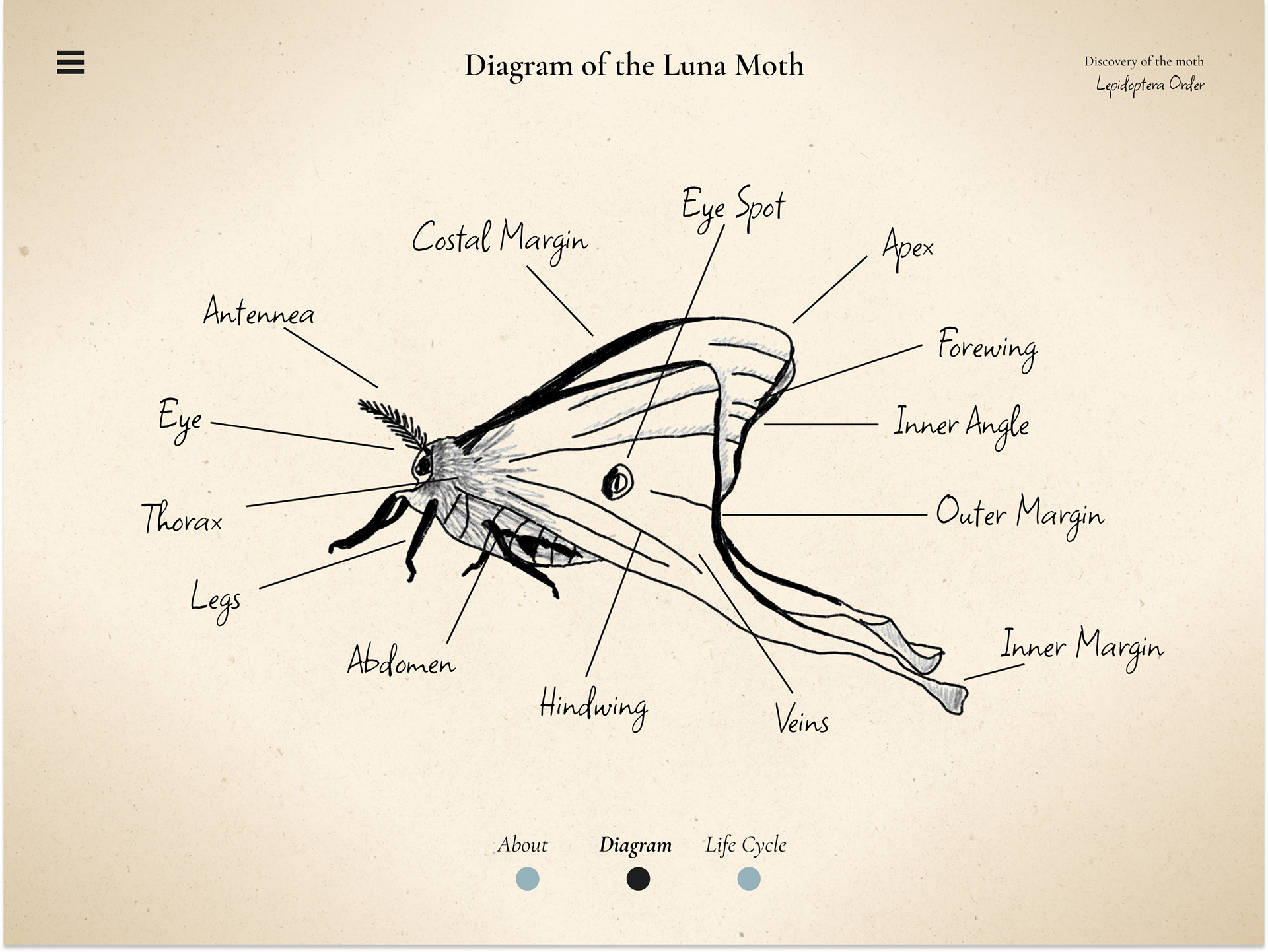
Diagram: Featuring all the parts of a moth's anatomy.
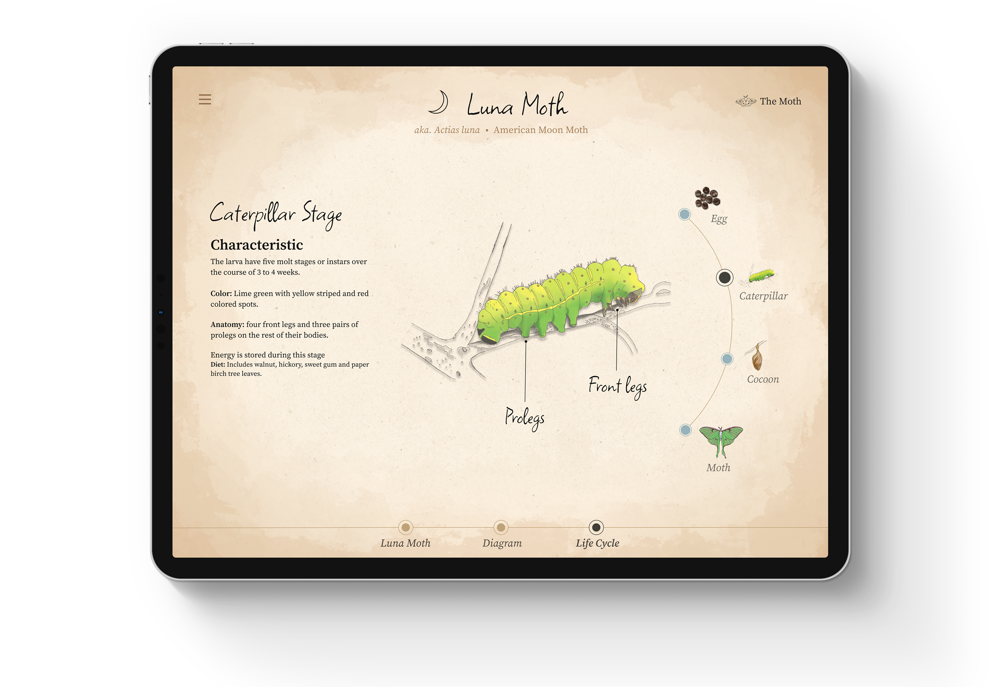
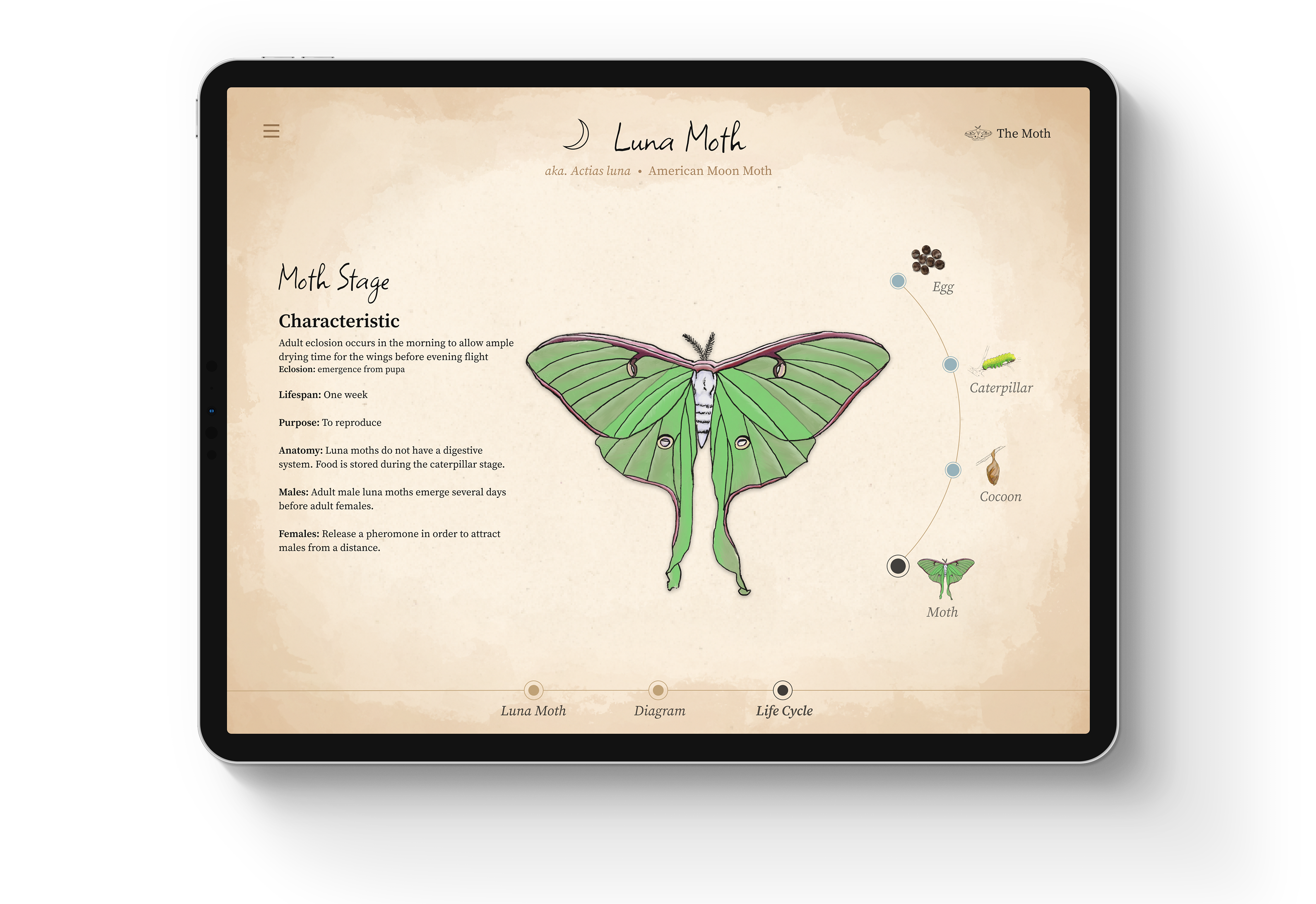
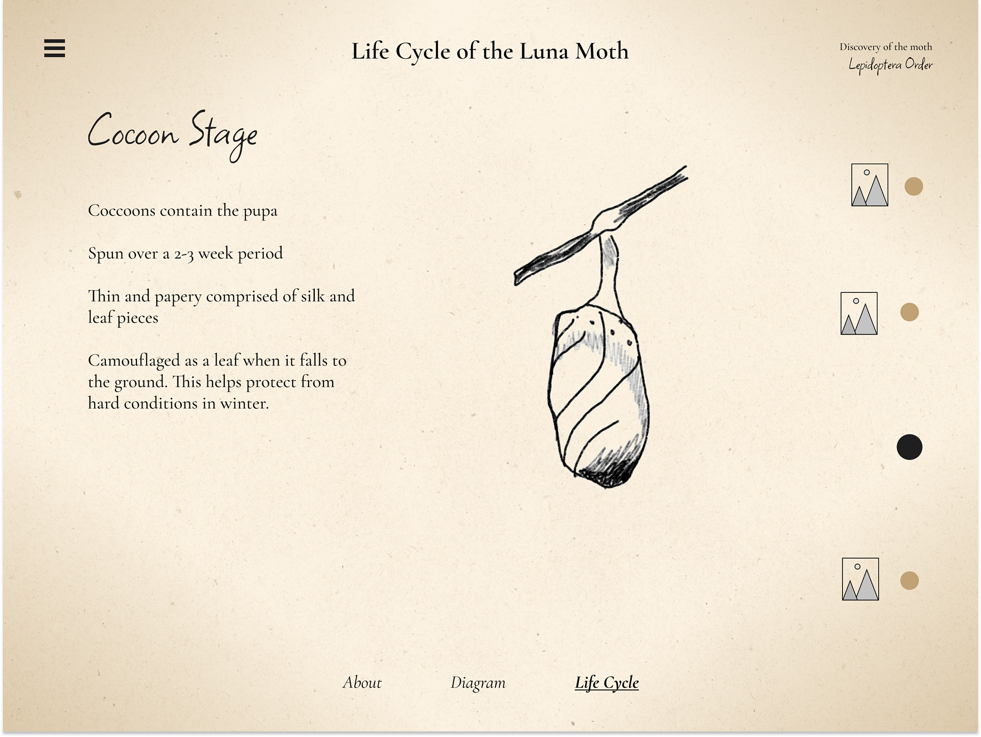
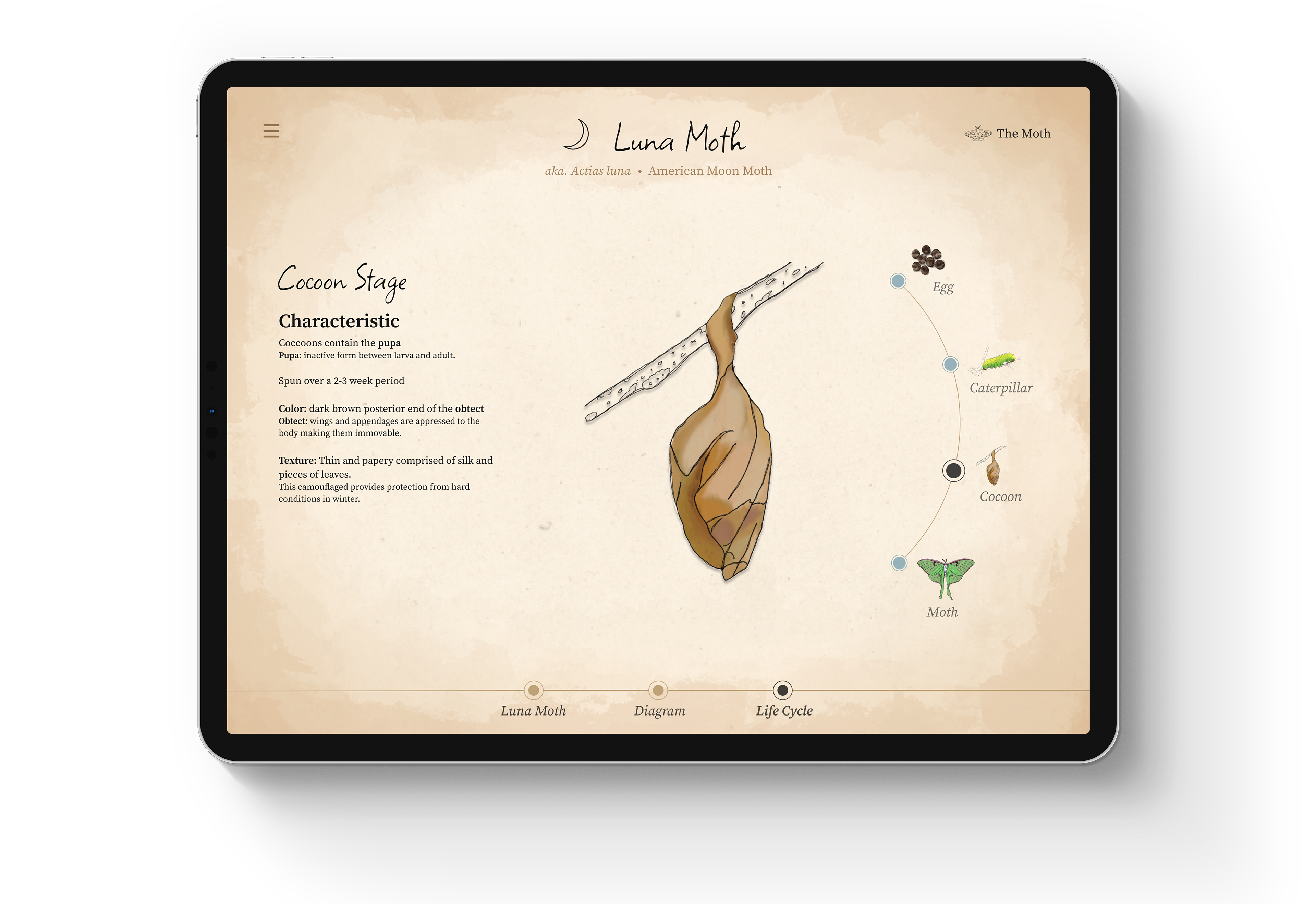
Life Cycle: Illustrating the life cycle of a moth and offering explanations for each phase.
About: Providing basic information about the selected moth.
Diagram: Featuring all the parts of a moth's anatomy.
Life Cycle: Illustrating the life cycle of a moth and offering explanations for each phase.

Hi-fi Wireframes
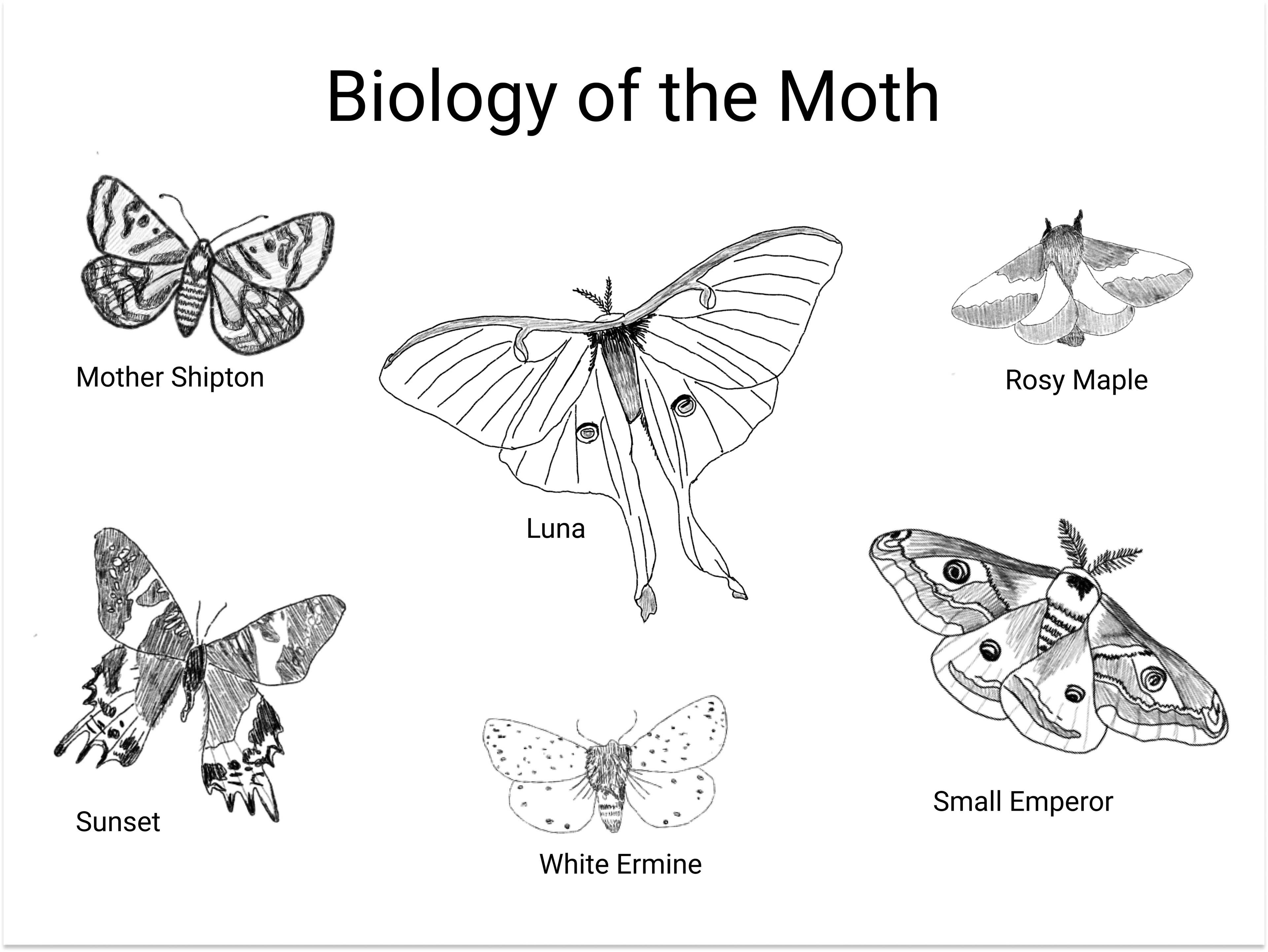
These wireframes depict the transition from low-fidelity to high-fidelity, illustrating the evolution in balancing imagery and information within the design.

Visual Style
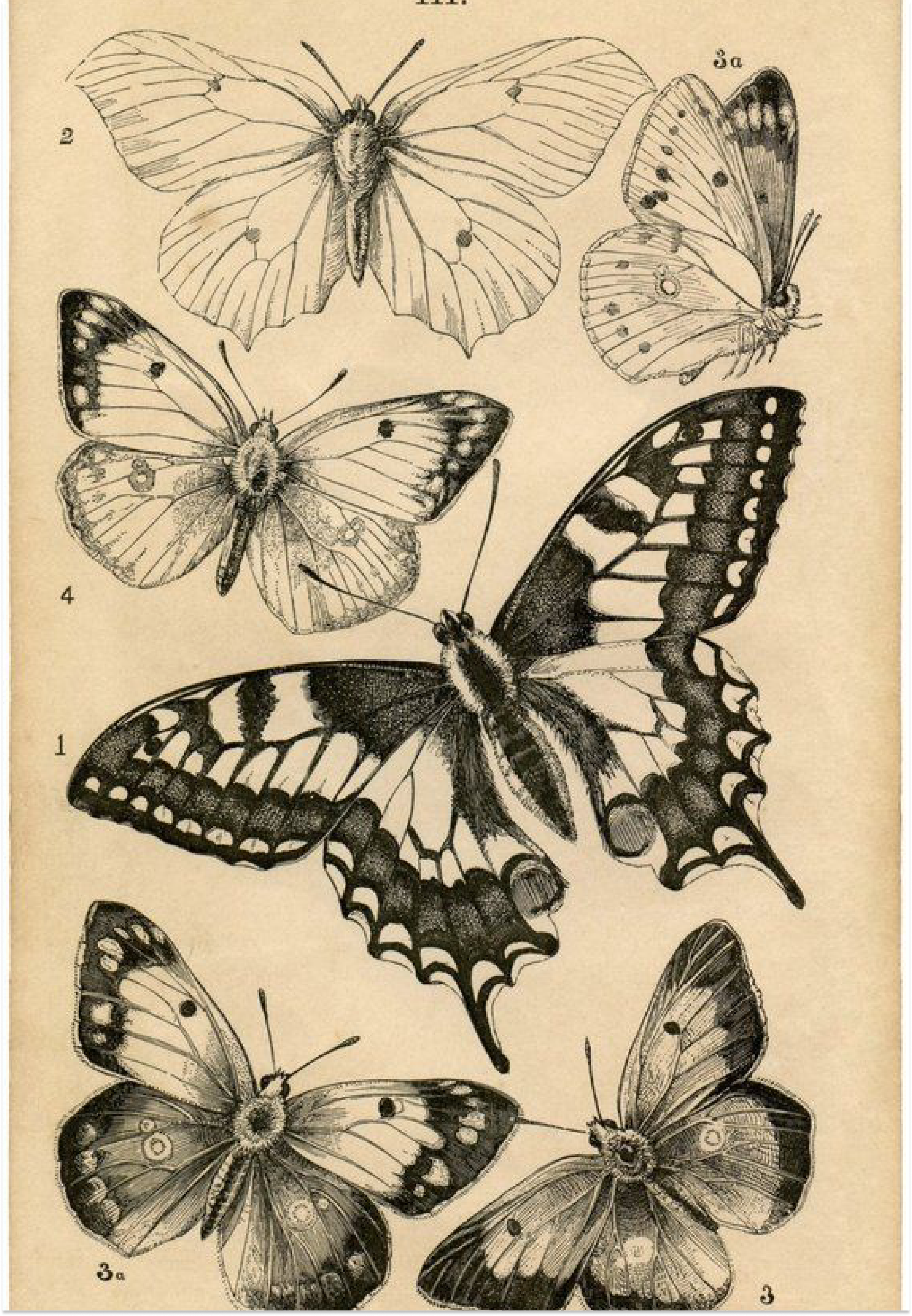
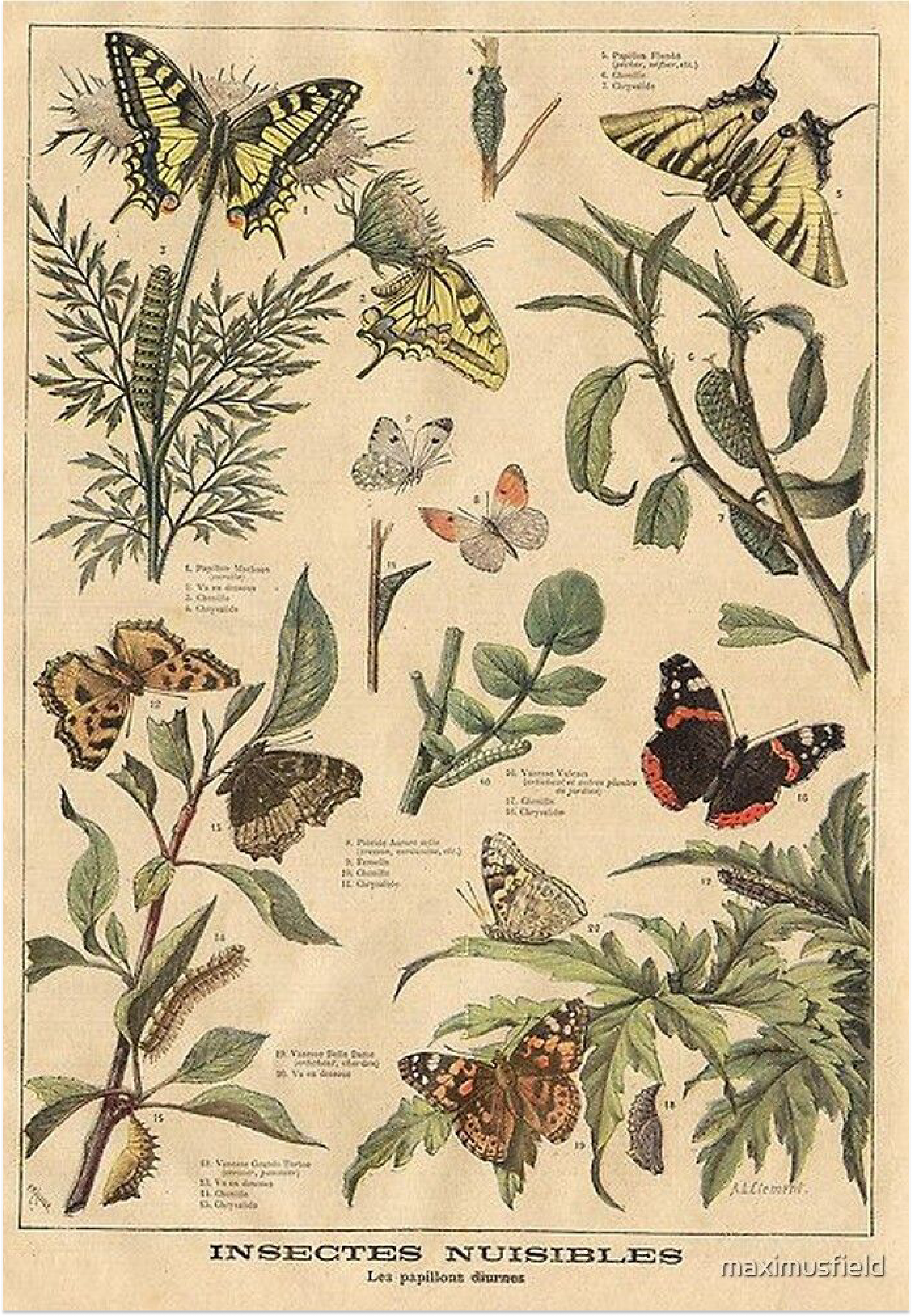
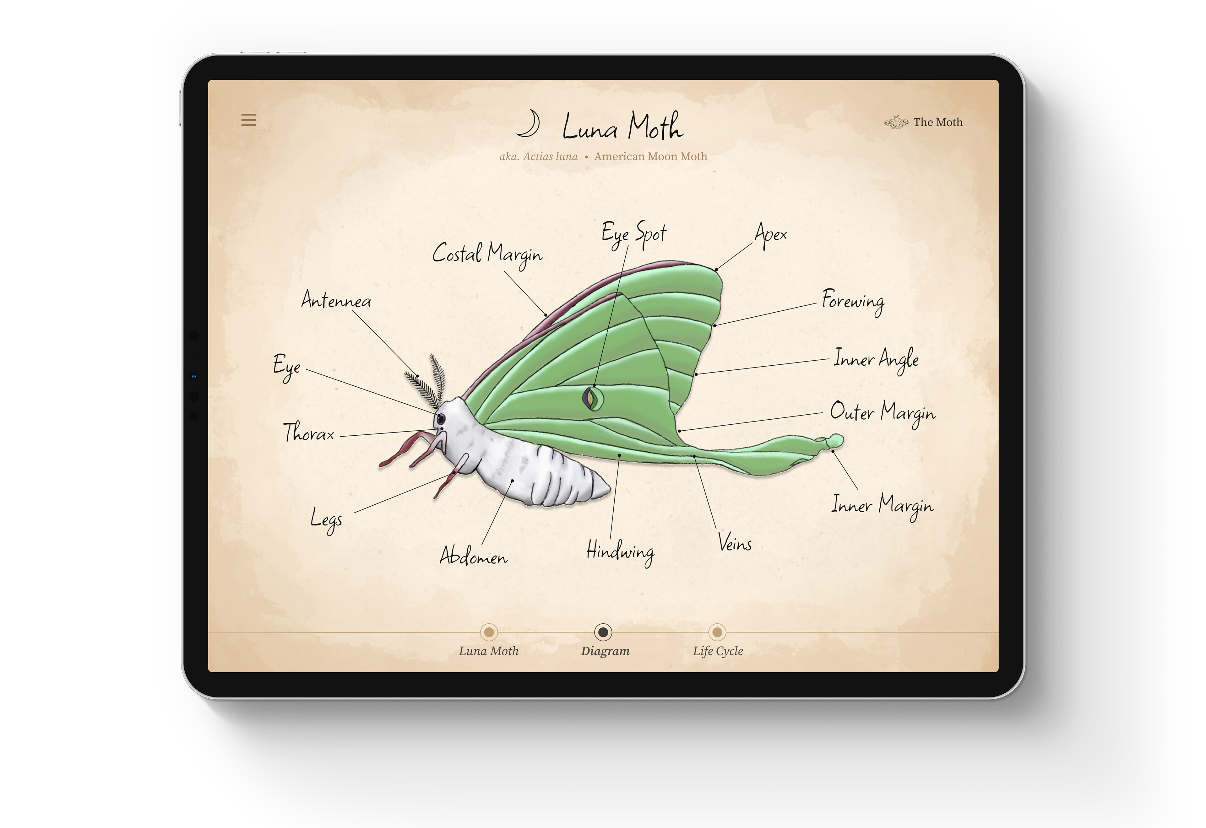
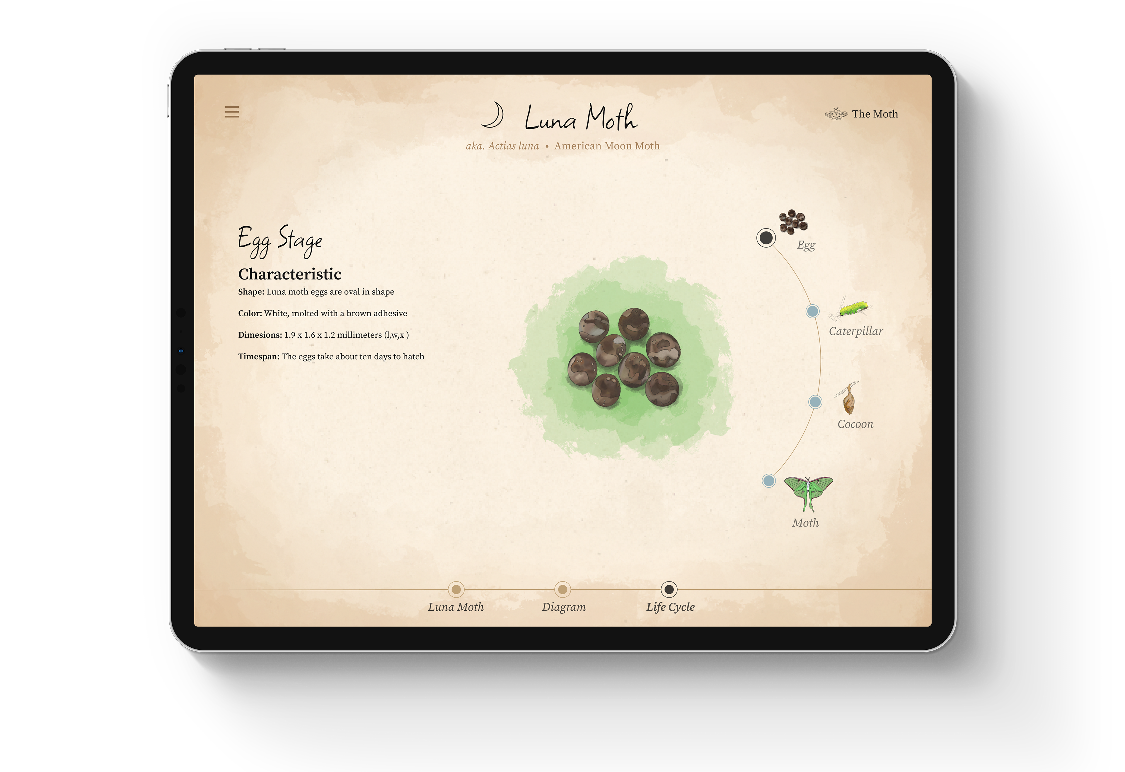
Discovery of the Moth adopts a scientific journal style, incorporating a vintage look and feel. Each moth is presented with realistic colors, while the UI elements maintain a neutral aesthetic.


Early Iterations
These early iterations of the application showcase the visual style inspired by scientific journals and highlight the progression from wireframes to the finalized design.
Final Compositions
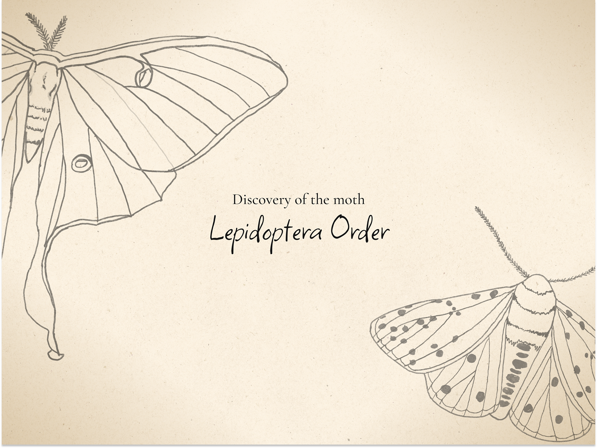
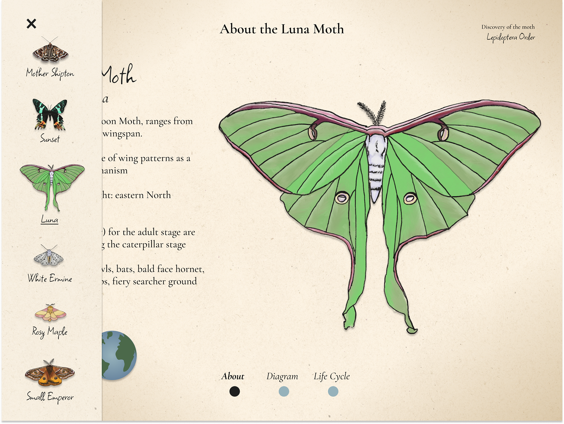
Presented here are the final designs for Discovery of the Moth, featuring all the screens that users would encounter while using the application.




Reflection
The most significant lesson I've learned from this project is the importance of good UI in design. grasping the concept of good UI is challenging, and its execution is even more complex. Throughout my iterations, a central aspect has been refining the UI—making decisions about placement and style to ensure the application is effortlessly navigable. This project has deepened my comprehension of what constitutes effective UI design.


